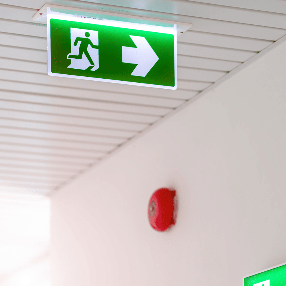
Signs are one of the few safety controls visible on a first walk-through. Safety sign placement gives auditors an early read on how a business manages risk, as long as they look past the front entrance.
Safety sign placement means where a sign sits relative to the hazard, the worker’s sightline and the point where a decision gets made. Done well, it gives someone time to stop or gear up before reaching the hazard.
Why Auditors Treat Signs as a Shortcut
Auditors read sign placement as a quick check on whether hazard identification ever made it from the risk register to the floor. Signs are among the cheaper controls to install, which makes them a useful place to look for shortcuts. Mismatches worth looking for on a first walk include:
- a PPE sign at a doorway where nobody past it is wearing that PPE
- danger signs on hazards that don’t carry a risk of death or serious injury, which wears down the meaning of the red oval
- hazards listed in the risk register with no matching sign on the approach
- confined spaces without the signage the WHS regulations specifically require
- an extinguisher sign above an empty bracket
Under the model WHS laws, a PCBU must manage risks so far as reasonably practicable. A PCBU is the person conducting a business or undertaking, covering most employers and many contractors. Victoria applies similar duties under its own OHS Act 2004.
Paperwork can be tidied up at a desk, so the floor tends to be the more honest record.
Signs Clustered at Reception Suggest Safety for Show
When signs are dense around reception and sparse in the back of house, the signage was mostly installed for visitors to see. It’s a pattern worth checking for on any site with a public-facing front office. Common markers include:
- new, matching signs at the front door, with mismatched or missing ones further in
- visitor induction signs in better condition than the machine guarding signs
- a framed safety policy in the foyer and no evacuation diagram near the loading dock
The front entry gets a polished set of PPE and visitor signs. Two aisles further in, where the plant actually runs, there’s a single faded warning on a column.
Workers pick up on this gap quickly. It shapes how seriously they take every other sign on site.
Signs Past the Hazard Point Show a Reactive Site
A sign mounted at or beyond the hazard usually went up after something went wrong. It marks the last incident, which is a few metres too late for the next one. Reactive signage tends to show up as:
- office-printed sheets standing in for proper sign stock
- warnings fixed to the hazard itself, with nothing on the approach
- incident-specific wording, the “mind the step, AGAIN” variety
- a batch of identical, freshly printed signs appearing the week after an audit
Approach distance shows why this kind of placement gives the game away. A forklift at 10 km/h covers nearly three metres every second. A warning that’s only readable two metres out leaves a pedestrian under a second to react.
Mixed Sign Styles Mean Nobody Owns Signage
When one site uses three different sign styles for the same message, signage is being bought piecemeal with no single person responsible. It’s a management gap that shows up on the walls.
AS 1319 is the Australian standard for workplace safety signs. It groups them into regulatory, hazard, emergency information and fire categories, each with set colours and shapes. That system lets the message land before anyone reads a word.
Sites that buy from whichever supplier is handy end up with a patchwork. Imported ISO 7010-style pictograms sit beside local AS 1319 designs, and wording drifts between departments. A worker who sees two different symbols for hearing protection can fairly assume the site isn’t too fussed about either.
Sign Clutter Means Hazards Were Never Ranked
Heavy sign clutter usually means every hazard got a sign because nobody ranked them by risk. The sheer volume tends to hide a risk assessment that was skipped or rushed.
Workers learn fast that most signs in a cluster don’t apply to their task. They stop reading the lot, and that habit follows them into areas where the sign genuinely matters.
A single door carrying traffic, PPE, hygiene, no-smoking and fire door signs is a familiar sight. Whichever message matters most on that door ends up competing with four others.
Frequently Asked Questions
Does Poor Sign Placement Breach WHS Laws?
It can, under both the model WHS laws and Victoria’s OHS Act. In WHS jurisdictions, the regulations require specific signage for confined spaces and asbestos. Chemical placarding mostly sits in those same regulations, though WA and Victoria cover it in separate dangerous goods laws. Beyond those cases, a poorly placed sign can show a duty holder hasn’t managed a risk so far as reasonably practicable.
Do Auditors Actually Judge a Business on Its Signs?
Yes, though rarely on signs alone. Signs are one of the fastest visible indicators of whether hazard identification has reached the floor. Mismatches tend to prompt closer questions about risk assessments and training records.
Can Good Sign Placement Make Up for Weak Controls?
No. Signs are an administrative control, sitting low on the hierarchy of controls. Good placement supports guarding and traffic segregation, and it can’t replace them. Auditors can read heavy reliance on signs as evidence the higher controls are missing.
Key Takeaways
Safety sign placement works as a visible record of how a business manages risk. The patterns are consistent enough to read on a single walk-through, provided it goes beyond the front entrance.
- Signs concentrated near reception suggest safety for show.
- Signs mounted at or past the hazard suggest a reactive culture.
- Clutter and mixed sign styles suggest nobody owns or ranks the hazards.
- Stale signs show the site changed without a signage review.
Mounting height shows whether drivers’ sightlines were ever considered.